STUDY SPACE
Find your place.

As a UX Designer, I helped design the app's layout. I also created UI elements backed by comprehensive research from stakeholders. 

Team Members

Sarah S.
Devin Mauldin 
Nashion D.
Rovid C.
Thanacha T.
Thomas B.

My Role

Created UI elements and conducted user research alongside a small team for an app called StudySpace. StudySpace enables students and professionals alike to find the perfect place to study. The key draw-in is that users have the ability to filter out locations based on their studying needs and write reviews.

Overview

StudySpace is an app that enables students and professionals alike to find the perfect place to study. It focuses primarily on ensuring that students of all types can find a suitable place to study that caters to their needs. If you're more on the quiet side, you can find quiet spaces on the map that fill that need. Likewise, if you'd prefer to use it as a tool to socialize and connect, there are plenty of spaces that fit the bill as well. StudySpace is all about maximizing productivity for as many people as possible. 

Goals

  • Establish two primary personas to guide design decisions.
 
  • Cater to both established personas.
 
  • Design an app where students can search for locations and converse in designated chatrooms.


Summary

StudySpace is designed to help students discover ideal study spots nearby while facilitating the formation of productive study groups and meaningful connections. Through peer-to-peer messaging and group chat functionalities, it allows users to organize and schedule meetings with peers, boosting efficiency in group studies. Its standout feature is the tag and filter system, empowering users to label locations, enabling others to find spots that align with their preferences. Whether you're a student or a professional seeking the perfect setting for work or study, StudySpace is the go-to app for finding your place. 

Problem Statement 

StudySpace is dedicated to aiding students in discovering fresh study environments within their local area, fostering connections with similar individuals and groups, and enhancing the overall efficiency of their studying endeavors. While Meet Up, Google Maps, and Yelp partially cater to these needs, they lack the specificity required to meet individual student requirements due to their broad user base. Our solution aims to bridge this gap by introducing an app tailored to students' needs, offering a platform where they can pinpoint locations using tailored suggestions and filters, alongside facilitating seamless communication and the creation of study groups.

Assumptions

At our kickoff meeting, we completed assumption statements. We assumed our app would be primarily used by students, white-collar/remote workers, and people who want to get to know their nearby area. We assumed our product would be used to save locations of interest and input user-generated tags to help other users find locations that satisfy a specific niche. We also guessed that users might want a designated chatroom for each location to store files and connect with those who frequent. This is useful for group projects and other collaboration efforts. From a business standpoint it would also capture more returning users. 

Competitive Audit

Googlemeetup
There is a large market for apps that allow users to meet up in person using a map system. With this in mind our team spent the first week conducting a competitive audit, research that summarizes what our competitors are already doing. Our top competitors are Google, and Meetup.com.

Google Maps
Pros:
  • Basic location information displayed.
  • Offers an estimated time duration for several means of transportation.
  • Widely used among multiple apps via easily integrated web API.
Cons:
  • No specific audience in mind. We exist to fill the niche for students.
  • No ability to filter out locations by specific tags for study needs.
  • Reviews differ from the student experience and may not be relevant or reliable.


Meetup
Pros:
  • Easily create attendable venues both in-person and remote.
  • Events display time duration and date.
  • Typically, only local events are displayed.
Cons:
  • Many events are created with the intention of advertising a product or scheme.
  • Hosting or attending often costs money.
  • Typically caters to much older demographic.


Google Maps gives the basics—location info and travel estimates—but misses out on student-centered filters and reviews. Meetup covers diverse events but leans towards product-oriented gatherings and attracts an older crowd. Our goal? We're aiming to carve out a spot for students hunting for tailored meetups, an area the market hasn't fully tapped into yet.

Lit Review

A lit review is an overview on previously written works on a given topic or field. Before diving into user interviews, we decided to research articles to give us an idea of how to conduct them. We also used this as an opportunity to figure out how to boost engagement.
 
“Conducting Stakeholder Interviews”
Laetitia Pouilly
  • Prepare a set of questions that can be adjusted depending on context.
  • Give the interviewee time to prepare.
  • Clarify the objective of the interview from the start. 
  • Think of an interview as an exchange of information, not an interrogation.

“5 Important Components Of Mobile Apps Which Boost Student Engagement”
Unifyed
  • Seamless feature integration.
  • Easy-to-use icons/buttons. 
  • Consistent updates. Iteration.
  • Chat features.

Laetitia Pouilly's insights in "Conducting Stakeholder Interviews" emphasized adaptable questions, allowing interviewees time to prepare, and framing interviews as information exchanges rather than interrogations. Additionally, Unifyed's article on "5 Important Components Of Mobile Apps Which Boost Student Engagement" highlighted critical elements to include in our design: seamless feature integration, user-friendly icons/buttons, regular updates and iteration, and the inclusion of chat features. These findings were vital when it came to shaping our approach going forward. We pivoted off from these ideals and began conducting stakeholder interviews. 
 

Interviews

Following our lit review, we proceeded with the stakeholder interviews as a pivotal step in gauging and refining our understanding of the market and problem space. 

Kennedy

  • Senior Interactive Design student
  • Identifies as introverted, dealt with anxiety first year of college.
  • She asserted that StudySpace could have served as "guardrails" during her freshman year to help her navigate through college by suggesting convenient places to study on campus.
  • Associates studying with the color blue.

SANTOS

  • Computer Science major.
  • Identifies as introverted, enjoys studying at cafes, libraries, and small restaurants.
  • Santiago prefers studying in public, preferably by himself. However, he is willing to use apps to meet new people for group work.
  • Also associates the studying with the color blue.

Amelia

  • Struggles with concentration while studying.
  • Prefers studying in groups to gain new perspectives and insight in her field of study. 
  • However, she does not enjoy working in groups where she feels she is not gaining anything from, or dealing with members who do not pull their weight. She has had many negative experiences where this has happened. 
  • Enjoys studying in public places like coffee shops for the environment and caffeine.

ELSIE

  • Excels at learning and enjoys research.
  • She tends to work at night and from home but prefers working in a group when the subject matter is challenging and complex.
  • Elsie values human interaction and believes that connections with others can facilitate group learning and studying.
  • Elsie considers the ambiance of the study space as an important factor in her ability to focus and be productive. Mentions coffee shops as an example of a conducive environment for her, with soothing lights, decorations, minimal movement, and low audio. 

ANAIS

  • Recent graduate from Wheaton University, works in marketing.
  • She has used apps like Google to find new locations but finds going to the same location boring quickly and is interested in the app's variety factor.
  • She believes in going to public spaces for focus, such as coffee shops, as the ambient tone and lack of major distractions allow for productive work or study sessions.

KAITLYN

  • Graphic Design student. Loves art, coffee, and music.
  • Prefers studying at home for convenience but feels more productive in public.
  • Values companionship and avoids feeling isolated during long study sessions.
  • Enjoys studying in groups when feeling stuck or burned out for a fresh perspective.
Affinity studyspace

Interview Summary

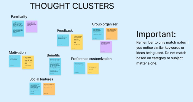
Across all interviews, several commonalities came up. Many stakeholders associated the act of studying with the color blue, highlighting a potential psychological connection. Public spaces, especially coffee shops, resonate as favored study spots for their conducive ambiance, minimal distractions, and the availability of caffeine. Group study holds value for gaining diverse perspectives and insights, but the success of collaborative efforts hinges on mutual productivity between all members. The desire for variety in study locations, the importance of ambiance for focus, and the need for companionship or interaction during study sessions stood out as recurring themes as well.

After the stakeholder interviews were completed, we transferred the notes over to an affinity diagram to draw focus to shared similarities.

Afterwards, we finally established our two personas. Meet Gam Blair and Matthew Cunningham!
Personas
We made two personas instead of one to drive home the idea that we wish for all kinds of people to receive benefits while using StudySpace.

The "introverted" side of our app would presumably focus on ensuring that quiet students are able to find spaces that cater to their needs. The "extroverted" side would cater to the social aspects of the app by behaving as a social network and allowing the creation of user-generated chatrooms for individual locations.

WIREFRAME

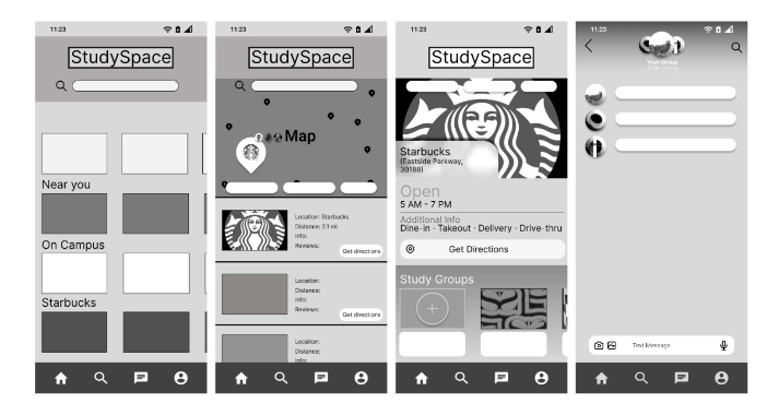
This is the figma wireframe that we constructed post-personas. It is low fidelity and is made from basic shapes. It is all gray scale so we could solely focus on layout and information schema. 
Wireframe studyspace

Thoughts from Stakeholders

Afterwards, we hosted a follow-up interview to get the general consensus on the wireframe. Here is the general overview of what they had to say:
  • Good visual hierarchy. 
  • Location recommendations based on proximity is a good idea.
  • Very clean despite being low fidelity.
  • Chat bar is crowded. Rearrange icons. 
  • The "Open" text should be more emboldened to draw focus to it.

Stakeholders praised the strong visual hierarchy and the idea of location recommendations based on proximity. Despite its low fidelity, the wireframe was considerably clean. However, concerns were raised about the crowded chat bar which suggested that a rearrangement of icons was in order for the next iteration. There was also a recommendation to embolden the "Open" text for enhanced focus within the design.
Studyspace final

Final Prototype

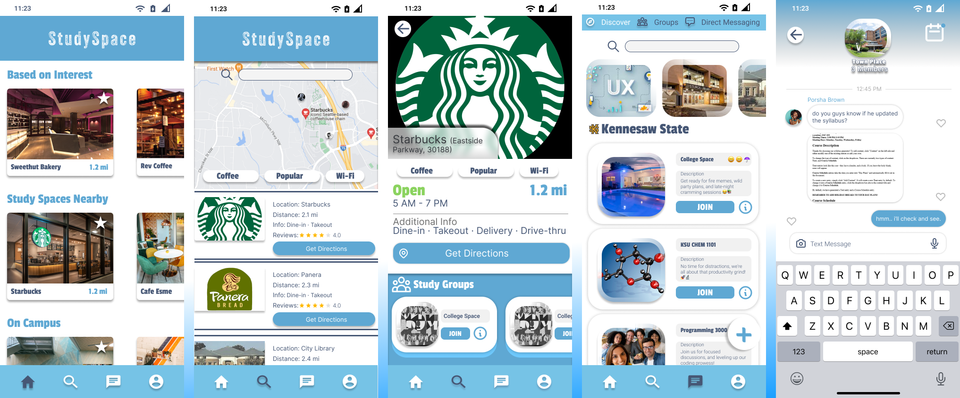
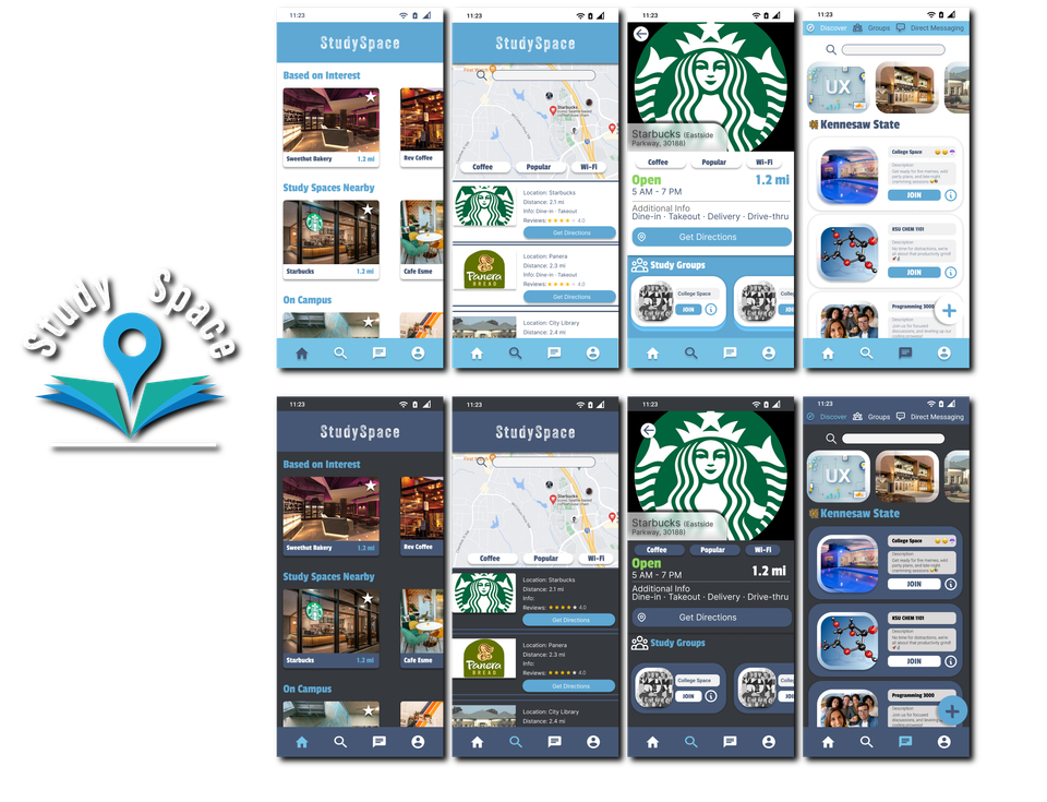
In the final version of our prototype, we really made it our mission to listen to user feedback. To reflect this, we made the chat bar less crowded and more compact. The Open text is emboldened with a bright, neon green to draw focus to it. This is an important detail, as this is the first thing users will look for upon browsing a location. On the chat room screen you'll notice the "Kennesaw State" header. We considered that students may want to link with their university to only limit to commonly visited locations at their school.

These key features all work together to ensure that users experience a satisfactory product that is personalized to their interests.
Studyspaceflow
Ss

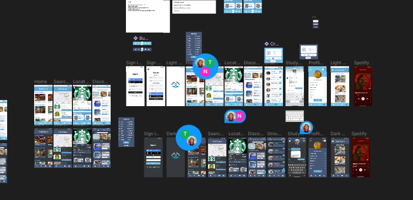
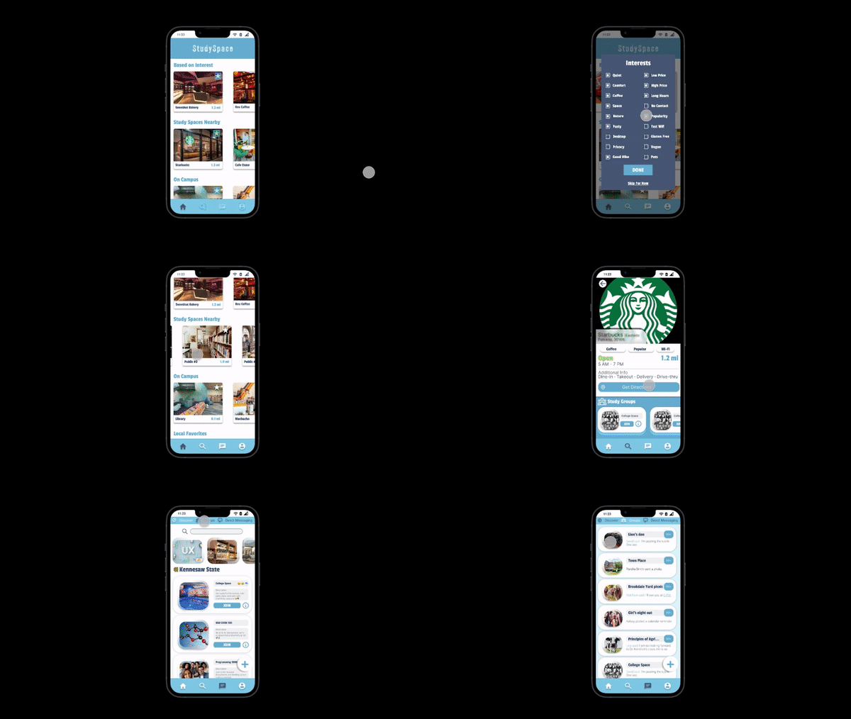
The user can view all of the finalized  features in this prototype and browse locations.
View Prototype

Conclusion

Through this project, I picked up some valuable lessons. Firstly, I learned the ropes of teamwork; how to collaborate effectively and divide tasks. The stakeholder interviews were also very eye-opening; they showed us who the app truly serves and directly impacts. Diving straight into design without considering our audience could've left us at a stand still and thus, unable to complete our goals by the deadline. The whole design process, from start to finish, really drove home the importance of wireframing. It helped us plan our layouts and design every step of the way. Considering this was my first collaboration project, I'd say that it went along well. It created some great connections and interactions, both with my team and of course, the users. I wouldn't want it any other way.