Job Quest
Buff your Career

I was a lead designer for Job Quest's design system.

Team Members

Elaine W.
Devin Mauldin 
Steven L.
Tracy B.
​Colin M.

My Role

I was a lead designer for Job Quest's design system. I was also a researcher for this project, facilitating meetings and organizing the data that we received from interviewees.

Overview

Job Quest is a social media app that caters to college graduates in need of constructive feedback, whether that be resume help, portfolios, or just general advice. Job Quest aims to boost careers in a safe and judgement-free space, while encouraging frequent engagement via daily challenges that can be completed in exchange for points and rewards! 

Goals

  • Create a platform where college graduates can reach employers.
 
  • Create a platform that encourages users to return.

  • Encourage a judgement-free community built on positivity, self-improvement, and constructive feedback.


LEAN UX METHODOLOGY

Lean UX is a design methodology that focuses on the user through an iterative learning process. Instead of banking on one idea over the course of months wondering whether a product meets business objectives, designers that follow Lean UX get immediate feedback and insights that either confirm or deny previous assumptions. Under Lean UX, there is room to improve a product, because there is also room for said product to fail. ​Our team applied Lean UX by forming assumptions about the market, creating experiments to test those assumptions, and interviewing participants within that space to gather informative insights about our target audience.

Summary

​Job Quest applied Lean UX to pivot from a basic job finding app to fostering connections and feedback. Through iterative testing, it prioritized peer networking and career growth, unveiling rewarding tasks and peer reviews. Integrating user insights, it addressed concerns like cyber-bullying and creating a platform incentivizing engagement and career development. The success, credited to Lean UX, encouraged continual improvement, prompting reflections on deeper insight meetings.

Problem Statement 

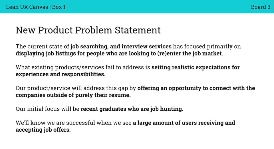
The current state of the apps for employment-focused platforms has focused primarily on making connections with peers and employers. What existing products/services fail to address is the lack of features centered around upward mobility and peer-to-peer feedback. Our product/service will address this gap by building a safe environment that incentivizes helping others with a feature that allows users to rate resumes, portfolios, and give advice. This will help foster deep connections in work environments.

Assumptions

During the initial stages of our project, we assumed that like most college graduates, our target audience's primarily goal would be to make contact with an employer and get a job. We also made general assumptions about this demographic, like that because many people in this stage do not have much experience on their belt, they would be looking for an app that allows them to connect with employers outside of their resume. We all agreed that the solution to confront this issue would be to allow companies to work with graduates on a trial basis and prove their skills.
Team elaine lean ux board box 1 new product problem statement outcome orig
While this idea may have sounded good on paper, a problem arose when we realized that this solution did not differ from other apps within this market space, i.e. Linkedin, Indeed, SnagAJob, etc.. While the idea may fit the bill for this demographic, that does not necessarily mean that they would use the app, considering other alternatives already fill that gap.

The main assumption that drove the project was that, at their core, the user wants to connect with peers within their major to help aid their job hunt endeavors. Connections are what drive the users. So, the question we asked ourselves was: "How could we reframe our idea in a way that focuses on connections, while still holding its own as a unique product?"

Proto-persona

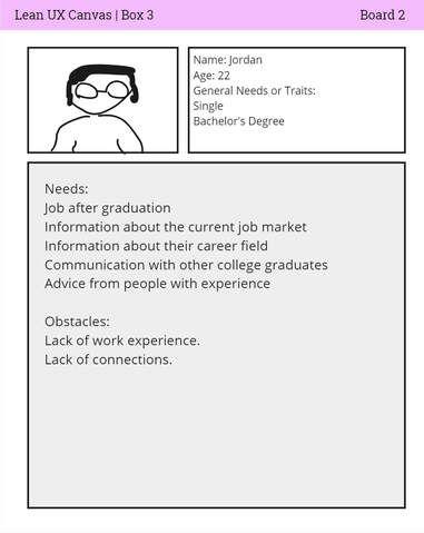
Team elaine lean ux board box 3 users
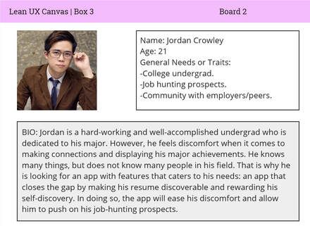
Meet Jordan Crowley, our initial persona we amalgamated based on our assumptions. This version differs from our final persona that comes in much later; he is a simple, straight-forward man who has recently obtained his bachelor's degree and is in dire need of a job. Sadly, beyond his paper degree, he is very lacking when it comes to actual experience, and so far, he has not been very successful in his job hunt. ​His primary goals are to receive a job, receive information of the current job market, communication with other college graduates like him, and advice from people with experience.

Hypotheses

Based on the assumptions that we formed, we created two hypotheses. Our first hypothesis was that users would be more likely to return if the app had a reward-based task to incentivize interactions. The second hypothesis was that we would see increased employment rates if our proto-persona, Jordan, could receive constructive feedback to improve his resumes with a resume rating system.

These hypotheses were important because they served as the basis for our experiments to gauge user interest.

Hypothesis 1

"​We will retain more users if Jordan can feel a sense of progress and obligation to advance in his job search endeavors with a reward system based on task completion.”

Hypothesis 2

“We will see increased employment rates if Jordan can use constructive feedback from experts in his field to improve his resume with a resume rating system.”

Experimentation (Sprint 1)

The two hypotheses were prioritized with two experiments respectively, an at-home scavenger hunt for hypothesis 1, and an advertisement for a fake portfolio/resume review seminar for hypothesis 2. Depending on engagement and willingness to cooperate amongst participants, it would either confirm or deny our two hypotheses.

At-Home Scavenger Hunt

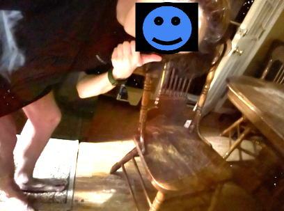
In Sprint 1 Week 1, participants were contacted and asked if they would be interested in an at-home scavenger hunt, where they would be required to snap photos of 10 common household objects for a $25 dollar reward. If users agreed and successfully snapped all 10 photos it would justify the need for an app where you can complete tasks in exchange for points and rewards. 

Results

All participants completed the activity, with relative ease, justifying an app with similar features. Participants reported that the challenges were easily accessible and quick to find, which made the process more enjoyable. As you might guess, participants also added that the $25 reward was a major motivator for completion, and that without it, they likely would not have been so open to volunteering.
Scavenger

Review Seminar

In Sprint 1 Week 2, a message was sent to multiple boards and forums, advertising an RSVP virtual portfolio review seminar. In actuality, the virtual event was not real, existing solely to gauge user interest. If users signed up for the RSVP form via email, it would justify the need for an app with a professional review system and constructive feedback.

Results

13 participants in total signed up for the virtual review seminar, indicating that within this demographic, there are people out there who are interested in improving their credentials through constructive feedback and professional review. It also suggests an openness to connection building. This number highly surpassed our expectations, considering what little resources we had at our disposal as far as marketing and outreach.
Portfolioseminar

User Testing (Sprint 2)

If the first sprint focused on experimentation, then the second sprint would focus solely on user testing. We set it up this way because we wanted to confirm both hypotheses before diving into the design stage. After our initial hypotheses were justified, we built a lo-fi user interface based on the features we tested for in the previous sprint, a task system and a portfolio/resume review system. Our goal was full functionality, as fast as possible.
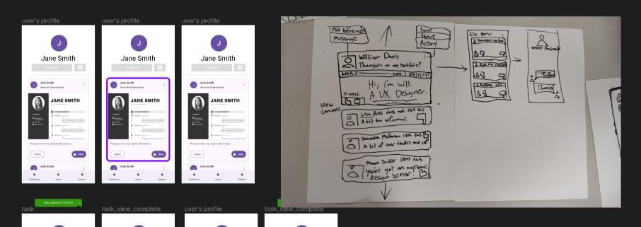
Jobquestflow
When it comes to designing UI, it is very tempting to fixate on the details and overdesign things that are inconsequential. Intricate home pages, settings, search bars, and other similar elements may add some level of depth to the UI, but in many cases, it serves as nothing more than added fluff with no real justification or meaning behind it.

A general rule of thumb we considered is that, if it isn't high risk, revolutionary, or at the very least a valuable addition to the features we're testing, then it probably isn't worth including.
Jobquestflow2
As a UX Designer, we may design user interfaces, but our priority is always centered around the user experience.

That is also why we utilized the Figma Material 3 design system, so our team could solely focus on capturing the main bulk of our ideas. As you can see, the overall layout of the UI is very low-fidelity, and that's okay. Our mission was to solely get the ideas functional and ready for testing.

Try our prototype for yourself here. 
For our user test, users were instructed to complete the prototype with as little help from the team as possible, sharing their screen as each team member observed. After they reached the end of the prototype, a 10 - 15 minute interview was conducted, where we asked general questions about their experience.

View a sample of our interview questions here.

Reward Based Task System

User consensus:
 
Positives
  • Tasks were straightforward and easy to complete.
  • ​Users agreed that the UI fit the type of app we were going for, a career building app with social   media elements.
  • Dopamine response.
  • Could potentially benefit users with ADHD.
 
Negatives
  • A few animation delays throughout the prototype. ​
  • Navbar doesn't follow the screen.
  • Point notification can be distracting for first time   users.

P/R Review System

User consensus:
 
Positives
  • Effective way of rallying in like-minded individuals aspiring to improve career prospects.
  • Allows users to help each other so their resumes do not get overlooked by employers.
  • Users stated that they had never seen this feature in other apps.
 
Negatives
  • In this flow, the challenges section in the nav bar switches to the home page. 
  • Potential risks for trolling and cyber-bullying.

Insight Summary
The prototype was met with an overall positive reception. Users agreed that the task system feature can be a great way to retain users. One user stated that any app with a strong user-base needs a key feature that incentivizes them to return. Instagram has likes and followers, LinkedIn has likes and connections, and Job Quest has likes, a task system, and a P/R rating system to encourage even deeper connections. The task system and P/R rating system also go hand in hand in that the task system encourages the user to continue engaging with others to help them grow.

Constantly engaging with peers will by default boost profile discoverability and exposure. Everyone wins under this system. Moving forward, the end game was to not only tweak errors that'd negatively impact the user experience, but also segue into a final high-fidelity prototype.

Final Persona

After user testing, it was time to give Jordan Crowley a story. The traits we gave Mr. Crowley were based on the cumulative insights and behaviors from our sample.

Here is a summary of who Jordan Crowley really is:

Needs:
  • An app that makes his resume discoverable. -A rewarding way to make connections with peers.
  • Easy way to connect with employers and representatives.
  • Information about the job market.

Pain Points: ​
  • Jordan does not have peers that are willing to give constructive feedback on his profile.
  • The absence of a structured reward system hinders Jordan's motivation to actively engage in providing constructive feedback to others.
Jordancrowley

Final Prototype

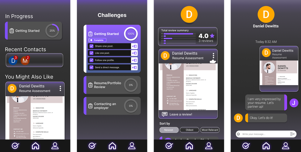
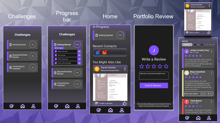
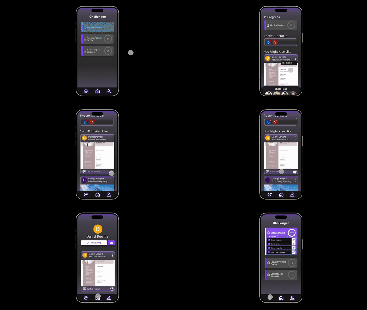
The final iteration required a complete overhaul of the Material 3 design system, now donning a darker, trendier color palette. All key features have been revamped in one way or another. Errors and flaws noted in the previous design have also been addressed.
Jobquestflow3
To summarize, the progress bar is now radial, and the P/R review page has an overlay where users can submit feedback under "Resume Assessment" posts. The progress bar is radial and thus, more compact, taking up less space on the screen. We also made sure to add a disclaimer at the bottom of the overlay to remind the user that they should always adhere to Job Quest's values and principles before posting. It could provide a slight buffer.

To combat cyber-bullying and/or hate speech, users can also determine whether review posts are relevant or not. Upon clicking "No" for "Not relevant," that individual post will disappear on the user's end. We considered that if a post gets pinged as "Not relevant" enough times, then that post will either be bumped to the bottom of the review feed or be removed outright.
Jobquestfullflow
Jq

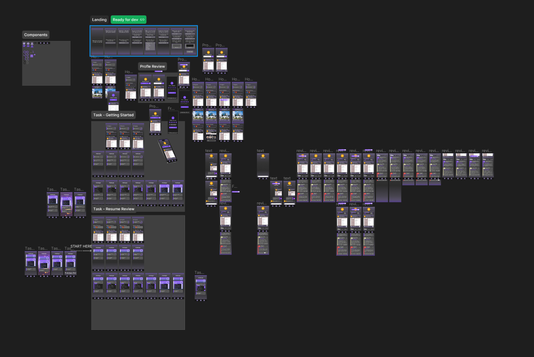
The user can view all of the finalized  features in this prototype and rate portfolios.
View Prototype

Conclusion

If there's anything I've learned from this project, it's that the things we achieved would have been much more difficult to accomplish without Lean UX. Lean UX is invaluable because it lets you bounce back from your mistakes and push forward headstrong. Our first prototype was full of many errors, bugs, and design flaws. Imagine if we continued with the project, unaware of these glaring issues that need to be addressed? The project would likely fail at launch, resulting in a waste of time, money, effort, and resources. Even our final project has its own problems, but the great thing about it is that with Lean UX there is literally always time to improve it. It prioritizes both the product and the user, so nothing gets wasted in the process.

This concept also ties to the behavior we wish to promote in Job Quest. It is much better for those looking for jobs to fail and learn now, than to navigate the job market under the assumption that you have everything figured out and continue to fail as a consequence.

If I could change one thing, I would have a reflection meeting after a major milestone. I think having that extra meeting would help the information we've gained marinate, giving us some breathing room to just sit and discuss our findings. We took notes of course, but more discussions could have helped us draw new connections and advance even further.

Otherwise, I am very satisfied with the end result, and it was a pleasure working with each and every one of my teammates. We each pulled our own weight until the very end!