Doodle Pies
Website Redesign

I redesigned a pie restaurant's website.

Overview

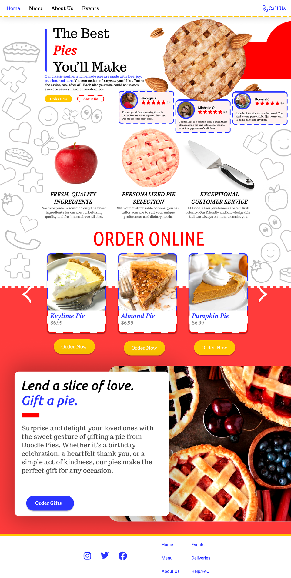
I redesigned a pie restaurant's website to improve usability and visual appeal. The new design features a clean layout, easy navigation, and high-quality images showcasing the menu. It enhances the online ordering experience while maintaining the restaurant’s warm, inviting brand.

Goals

  • Create a design that uses a modern design to attract more customers.
  • Maintain a warm and inviting aesthetic that reflects the restaurant.
  • High quality visuals to enhance appeal.


Page 1

Justification - Home

The home page uses bright colors like red, blue, and yellow to grab attention and make the site feel lively and welcoming. These colors are eye-catching and help create a fun, warm, and exciting atmosphere. The large images of pies make the food look appetizing and encourage visitors to explore the menu. A simple white background keeps things clean and makes the colorful elements pop, while still being easy to read. This design helps visitors feel at home and excited to order, creating a strong connection with the restaurant’s overall vibe.

Playful doodles and drawings are incorporated into the sides and background, adding a creative and lighthearted atmosphere.
Page 2

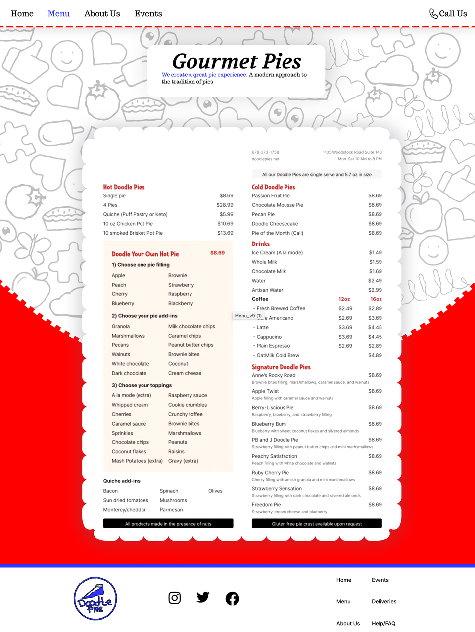
Justification - Menu

The Gourmet Pie menu page features a paper cutout-esque design, giving it a handmade feel that matches the restaurant’s theme. The playful doodles add personality and vibrance, making the menu page more appealing. A red section of the background creates contrast with the menu and encourages action. These elements create a visually clear and inviting menu.
Page4

Justification - Events

The Events page highlights upcoming gatherings and celebrations, with strong visual contrast. The page features a pie surrounded by confetti, adding a festive touch. This design directs focus to the events while once again maintaining a fun and energetic atmosphere.

Conclusion

The redesigned website for the pie restaurant focuses on creating an engaging and user-friendly experience. With colors like red, blue, and yellow, the design grabs attention while drawing customers into the brand's atmosphere.

The Home page’s doodles and drawings add personality, while the red accents guide users to key sections, such as the ordering area. This use of color and visuals enhances the brand’s vibe, making the website approachable. The layout ensures visitors can easily navigate and place orders, fulfilling the goal of improving the online ordering experience.

The Pie Menu page delivers on the goal of making the menu clear and easy to use. The paper cut-out design, doodles, and red background create a fun, engaging experience while making the menu clear and inviting. The design maintains the restaurant's overall feel and encourages customers to explore the selection.

Lastly, the Events page aligns with the overall goal of boosting engagement and excitement. The red background and pie surrounded by confetti draw attention to upcoming events and promote customer participation. This focus ensures the events page is not only informative but also enticing. In conclusion, the website redesign successfully meets its goals by creating an enjoyable and functional experience for users.

Through the use of colors, enticing visuals, and design, the site draws customers in and encourages interaction, making it an overall better experience when it comes to exploring the website's layout.