PICMO
Streaming App

I created a responsive design for a streaming service.

Overview

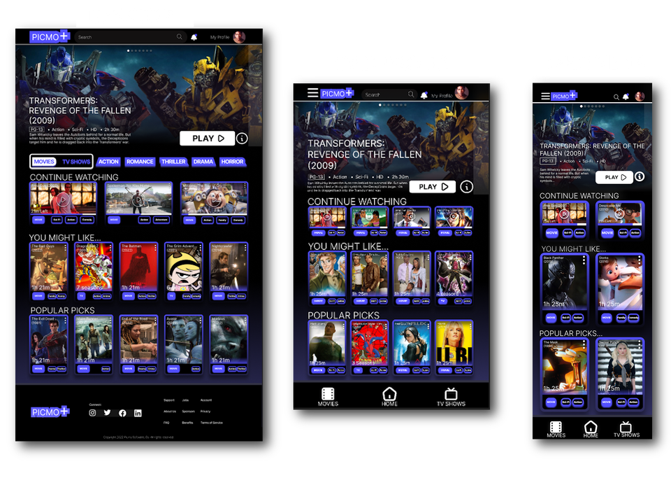
Utilizing design principles from the book "Dont Make Me Think," by Steve Krug, I produced three responsive designs for a movie/television streaming app called Picmo, demonstrating accessible and intuitive design. I prioritized the responsiveness of this project with three frames in Figma, Desktop (1440 x 1024), iPad Pro 12.9 (1024 x 1366), and iPhone 14 (390 x 844).

Goals

  • Create a design that is self-evident and intuitive.
 
  • Prioritize responsive design with 3 adjustable frame sizes.
 
  • Reference Steve Krug's philosophies in the justifications.

 
Picmodesktop

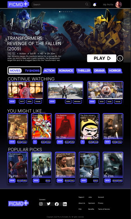
Justification - Desktop

A streaming service website that offers a wide selection of tv shows and movies. People would come here to quickly browse and access their favorite content, so with this in mind, everything the user needs is stored at the top, making the most useful features easily visible and accessible. There is a search bar at the top of the screen, a genre bar for browsing between movies, tv shows, and browsing specific genres. The design focuses on the user’s wants by quickly enabling returning users to pick up where they last left off, as well as recommending a list of content suggestions that the user might be interested in below. Because these features are easily accessible and have words that outright tell you their intended function, there is little confusion as to what the site is for and what it is capable of doing. There's virtually zero reliance on “cute or clever names,” as Krug puts it.

(Krug, p. 14)
Picmoipad

Justification - iPad Pro 12.9

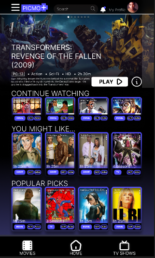
For the iPad layout, the genre bar has been removed entirely and would be located underneath the hamburger for a more functional prototype. Although you could argue that placing the genres behind the hamburger icon adds an extra step to finding them, Steve Krug makes a point that you can’t make everything self-evident. In some cases, tradeoffs are necessary to maintain design cohesion. (Krug, p. 18) To translate the design to mobile, I added a dock bar at the bottom containing a section for movies, the home page, and tv shows.
Picmoiphone

Justification - iPhone 14

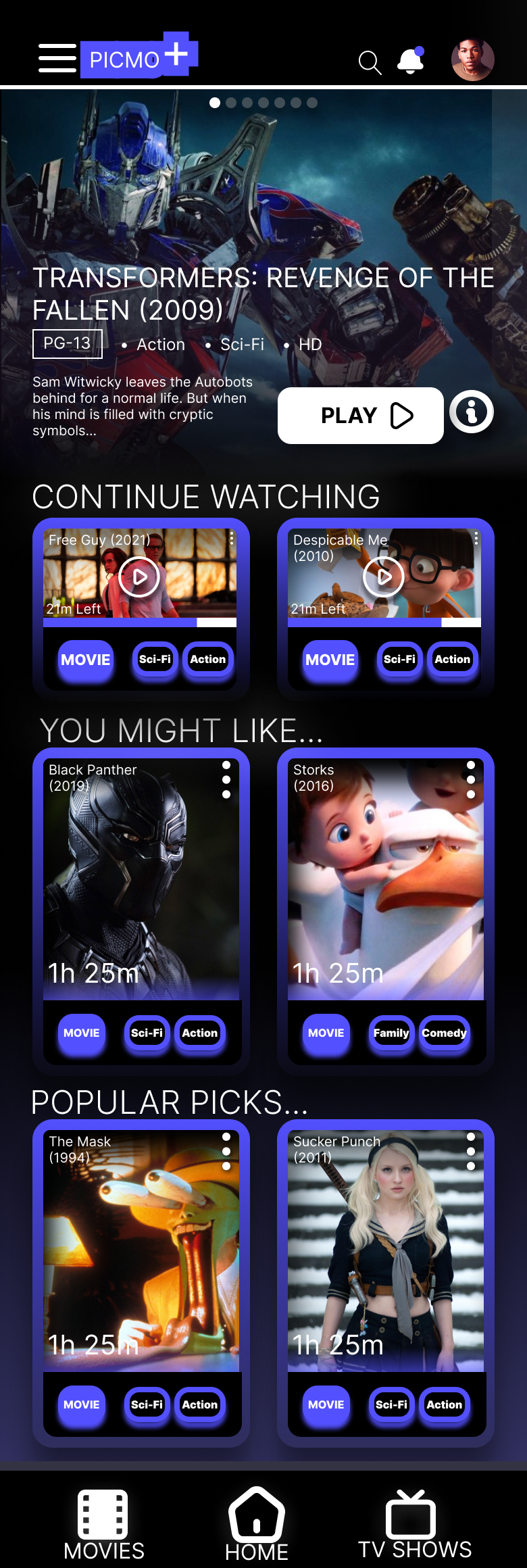
For the iPhone layout, the video frames have shrunk, and the search bar has been replaced with a smaller magnifying glass icon. Despite these changes, this design is perfect for muddling users' intent on quick movie and television browsing on the fly.  Most of the main features are labelled or are at the very least self-evident, which makes it easy for users to muddle through. People don’t like figuring out how things work, they’d much skim to their desired destination, (Krug, p.  26) and my design allows just that.

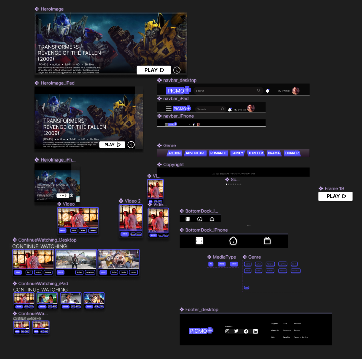
Components

Picmocomponents
Picmoresponsive

Conclusion

In building this streaming service design, it should be fairly easy to spot your favorite movies and shows. I followed Steve Krug's design principles to keep things clear and straightforward. I relocated the categories to the navigation bar at the bottom to keep the mobile designs looking sleek and clean. On iPhone screens, I tweaked things, making the video frames smaller and swapping the search bar for a tiny magnifying glass. I had to move many items around while ensuring that they would still be in a reasonable location for the user's browsing pleasure. It might take getting used to for someone switching from desktop to mobile, but overall, this was a great exercise in staying mindful of balancing style and responsive design.